Dolores Outpost
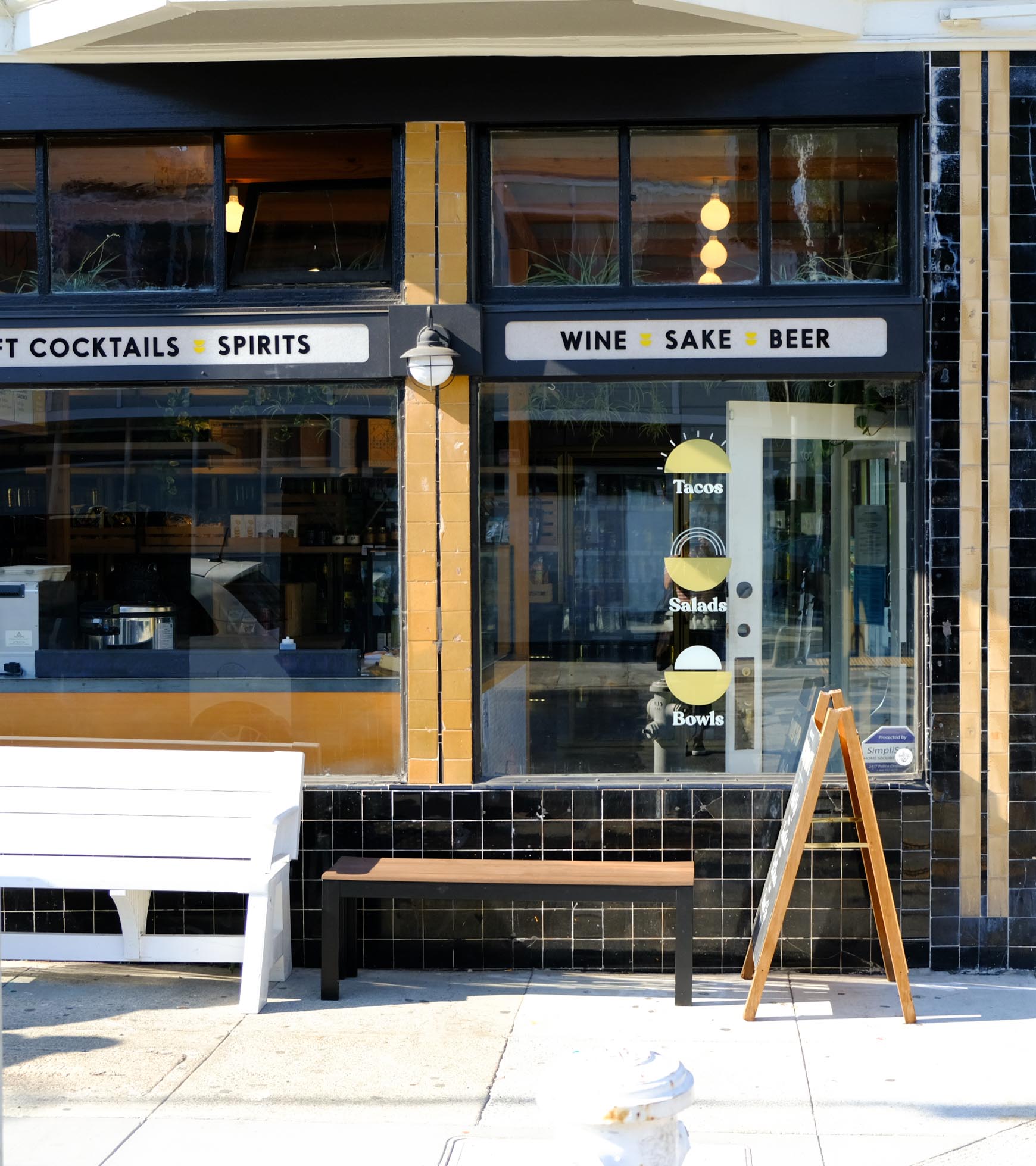
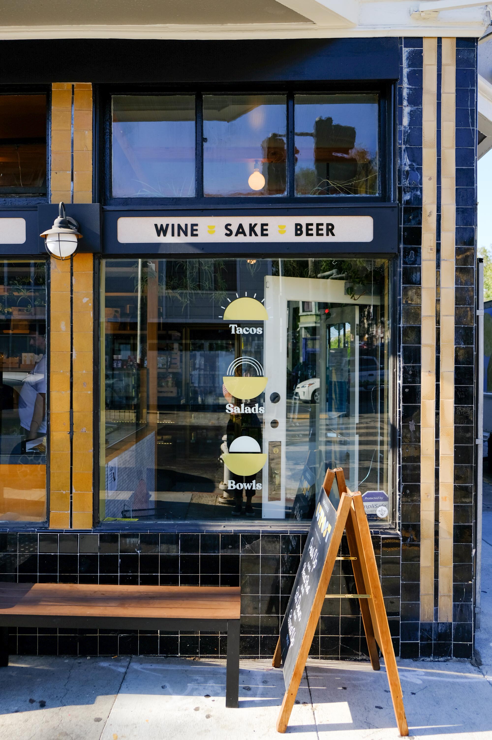
Identity, Print, Web, Environmental, PackagingDolores Outpost is a neighborhood corner store just a stonesthrow away from San Francisco’s beloved Dolores Park, making it a prime location to load up on all the comforts for a picnic at the park. Stockpiled with international snacks, trans-Pacific inspired menu (including housemade spam) and bento boxes, plus an array of drinks to wash it all down with everything from craft beer, local wine, Japanese whisky, coffee and matcha concoctions to keep park-goers happy, hydrated, and well fed.
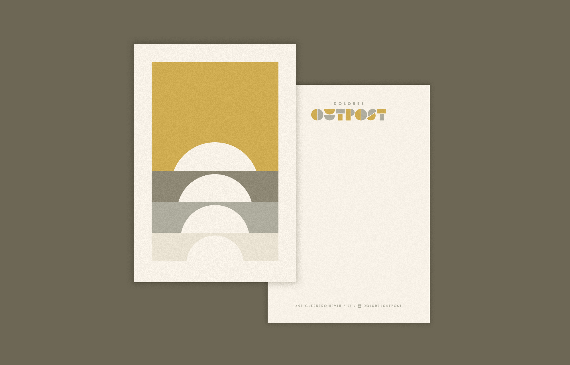
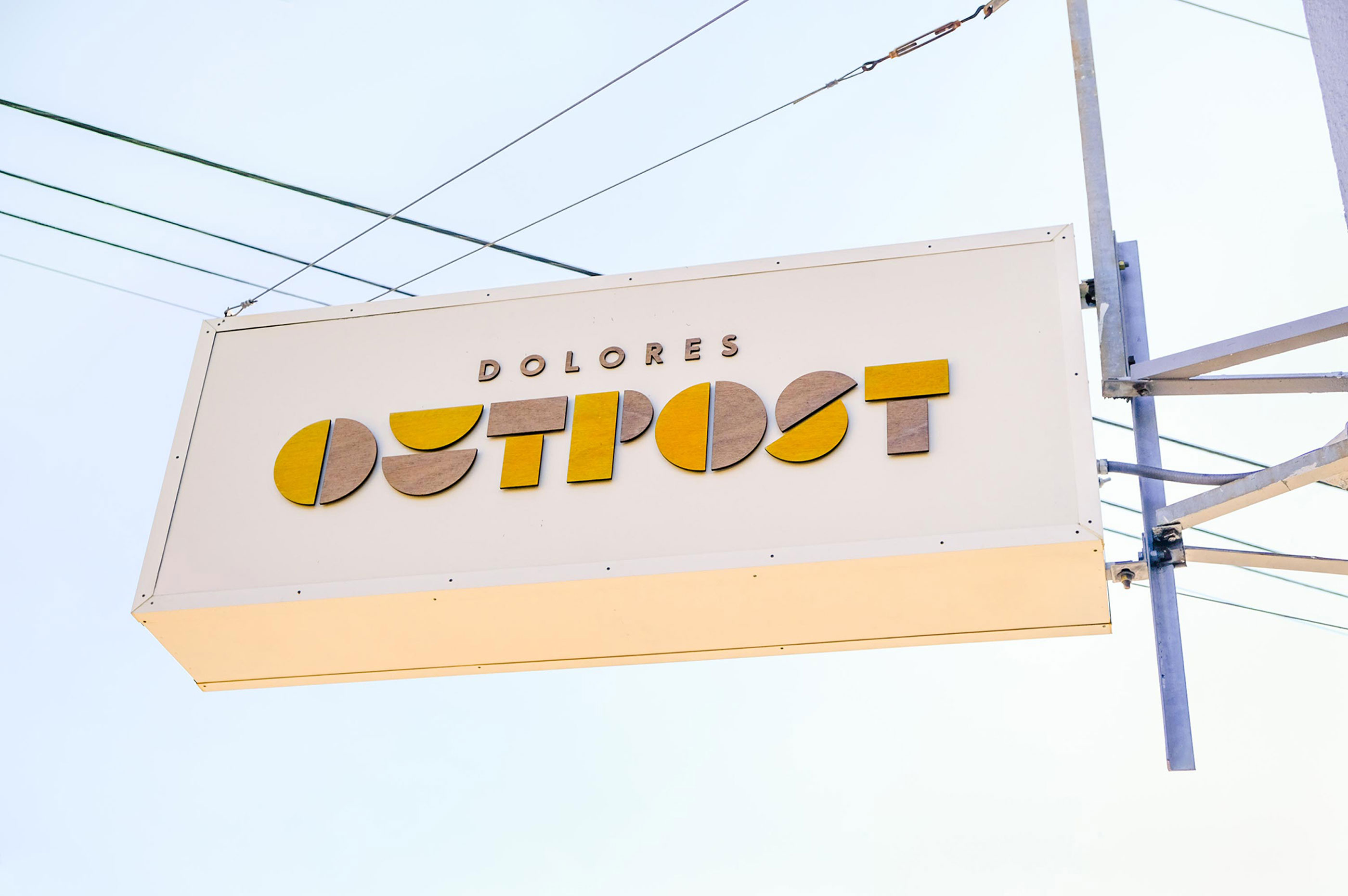
With roots in Hawaii, Japan, and northern California, the founders were looking for an identity inspired by the Pacific Rim with the laid back feeling of a picnic on a Sunday afternoon. I made the logo out of shape combinations that tie into underlying forms throughout the space – from the custom ceiling panels to the interlocking shelving system. The shapes make for an endless series of patterns, dressed in neutrals and taupes, with pops of ochre like a hint of washed out sunshine and tying back to the existing tile color on the shop façade. Meanwhile, natural elements like cedar wood and shapes of the sun are sprinkled throughout the space, everywhere from the shelf talker, to the menu board, and exterior sign.
Currently in production on the website, and both coffee and wine packaging. Check back soon for more.
Interior: Brent Kanbayashi